Overview
BSI (British Standards Institute) is the UK standards body and global certification body. They are the issuers of the British Kite Mark among other standards. They offer standards and training across a wide range of industries and sectors around the world.
Problem statement
BSI commissioned a competitor benchmark around 3-4 years ago. Since then they have re-designed their website and made lots of improvements to the user experience. But so have most of their competitors around the world. And new competitors have been founded.
BSI wanted to do another benchmark project using the same criteria as the previous one to see how their score improved, how their competitors had improved and to get scoring on new competitors. And to highlight any potential areas of improvement for their current website.
BSI are a large company and offer lots of standards, their competitors varied in size and offerings and they needed a way to take this in to account in the scores.
Users and audience
This report went out to key senior stakeholders across BSI including the leadership (including the CEO) and the people who own certain parts of the website.
Roles and responsibilities
The project team: senior experience designer (me), lead experience designer (oversight), early stage designer, senior project manager, senior client partner, chief marketing officer (BSI), director of brand marketing (BSI), Chief product officer (BSI).
My personal roles on the project:
- leading the project
- stakeholder management
- conducting the benchmarking and heuristic evaluations of competitors
- analysis
- setting the structure and direction of the report
- writing the report
- playing back the report to BSI
Scope and constraints
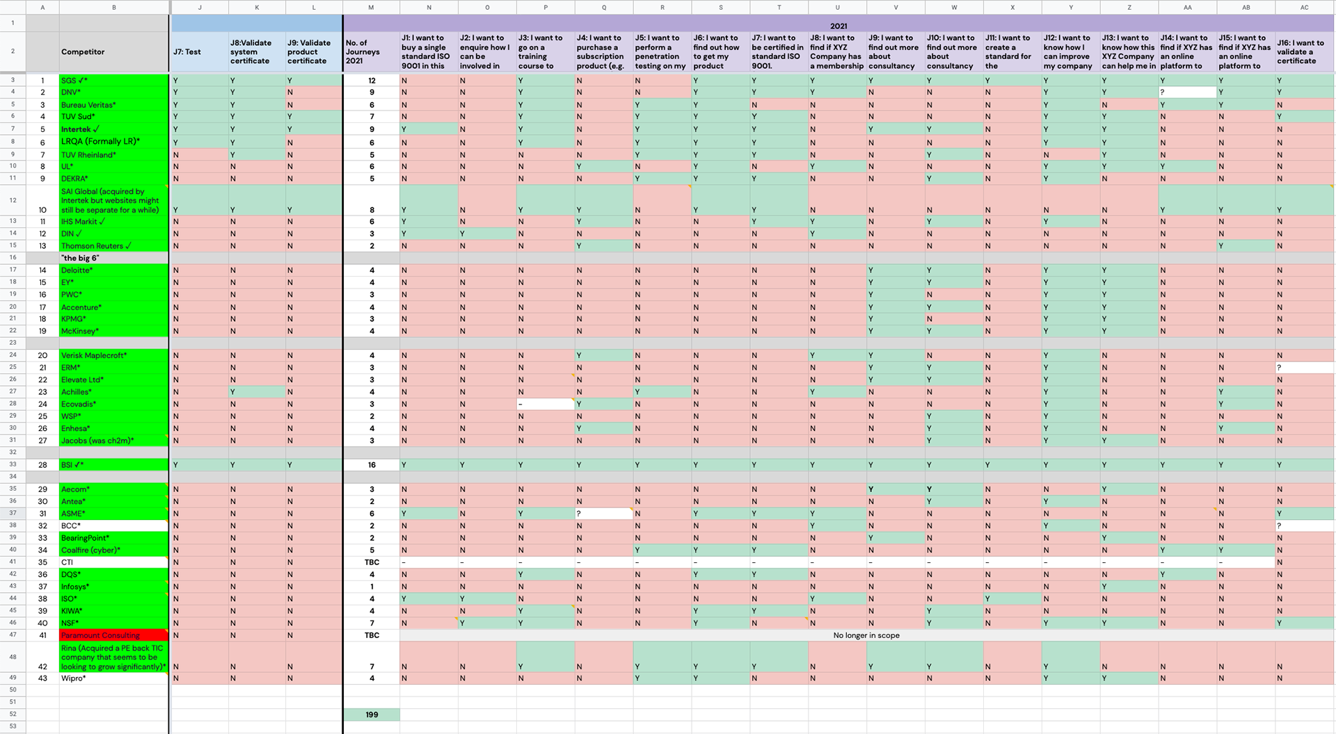
To benchmark 41 competitor websites (and the BSI website) provided by BSI against 15 journeys (if each competitor had them). Totalling 199 journeys across 41 competitors and BSI once we had assessed what competitor had the journeys. Then compile a report which included:
- an executive summary
- key high level learnings
- over all company rankings table
- analysis by competitor
- analysis by journey
- recommendations
Process and what I did
Firstly we created a matrix of what journeys each of the competitors had which made the process of scoring them more efficient.
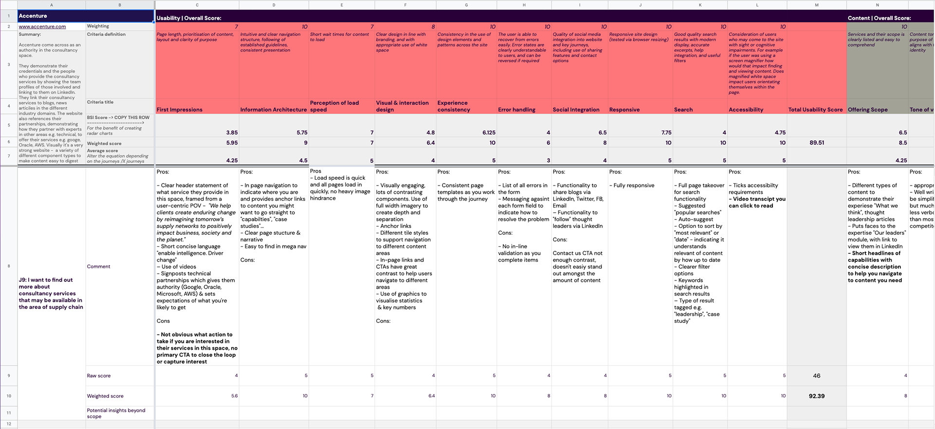
We then reused the previous scoring criteria to score the competitors and take notes of key points we saw during the scoring. The criteria that we scored the companies against was split into 2 groups; usability and content:
Usability:
- First impressions
- Information architecture
- Load speed
- Visual and design interaction design
- Experience consistency
- Social integration
- Responsiveness
- Search
- Accessibility
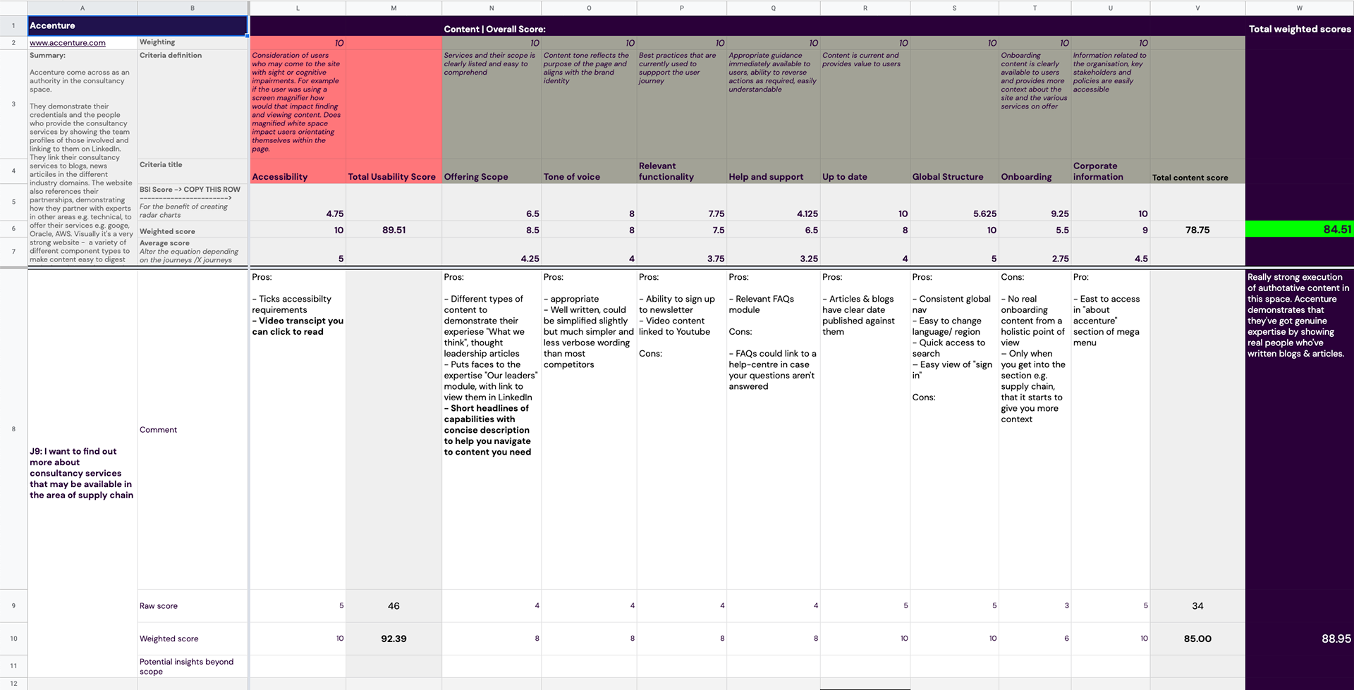
Content:
- Offering and scope
- Tone of voice
- Relevant functionality
- Help and support
- Up to date
- Global structure
- Onboarding
- Corporate information
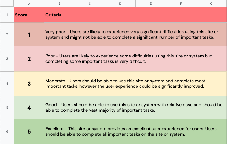
Scoring:
- Each item in usability and content got a score out of 5
- Each group (usability and content) got a total score
- Each journey then got a total score
- The competitor got an overall score out of 100
The criteria had to be weighted as not all competitors offered all of the journeys so we needed to ensure they were not penalised for not offering a particular service as it may not be part of that competitors strategic vision.
We pulled out some findings and recommendations for BSI to action. We also highlighted some themes we spotted across all competitors.
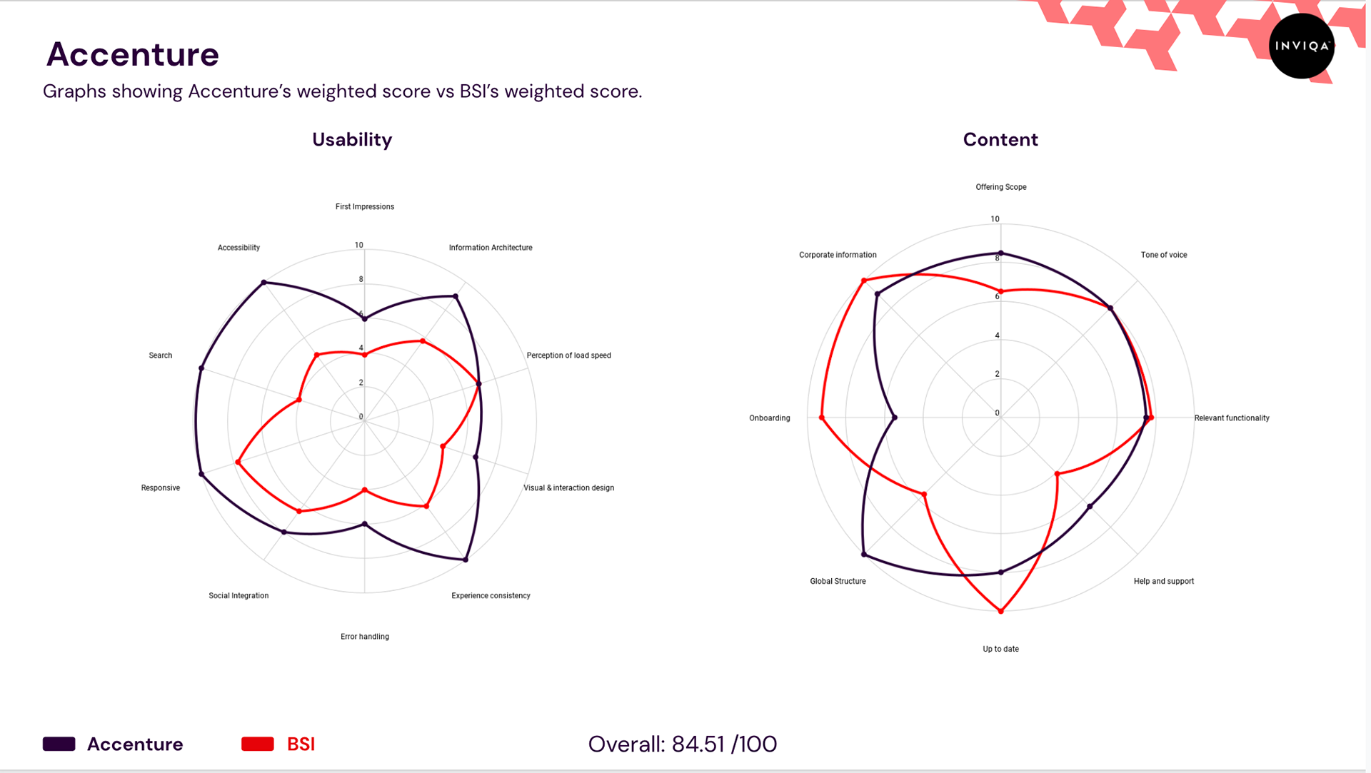
We then created radar diagrams using the scoring criteria of the competitor score and BSI score to show a direct visual comparison between the two.
We then created the report which involved:
- analysis
- compiled the report
- created charts and other data visualisations to show the score comparisons
Finally we played back the results to the client.
Outcomes and lessons
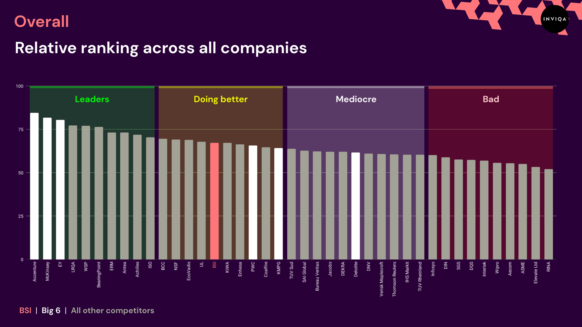
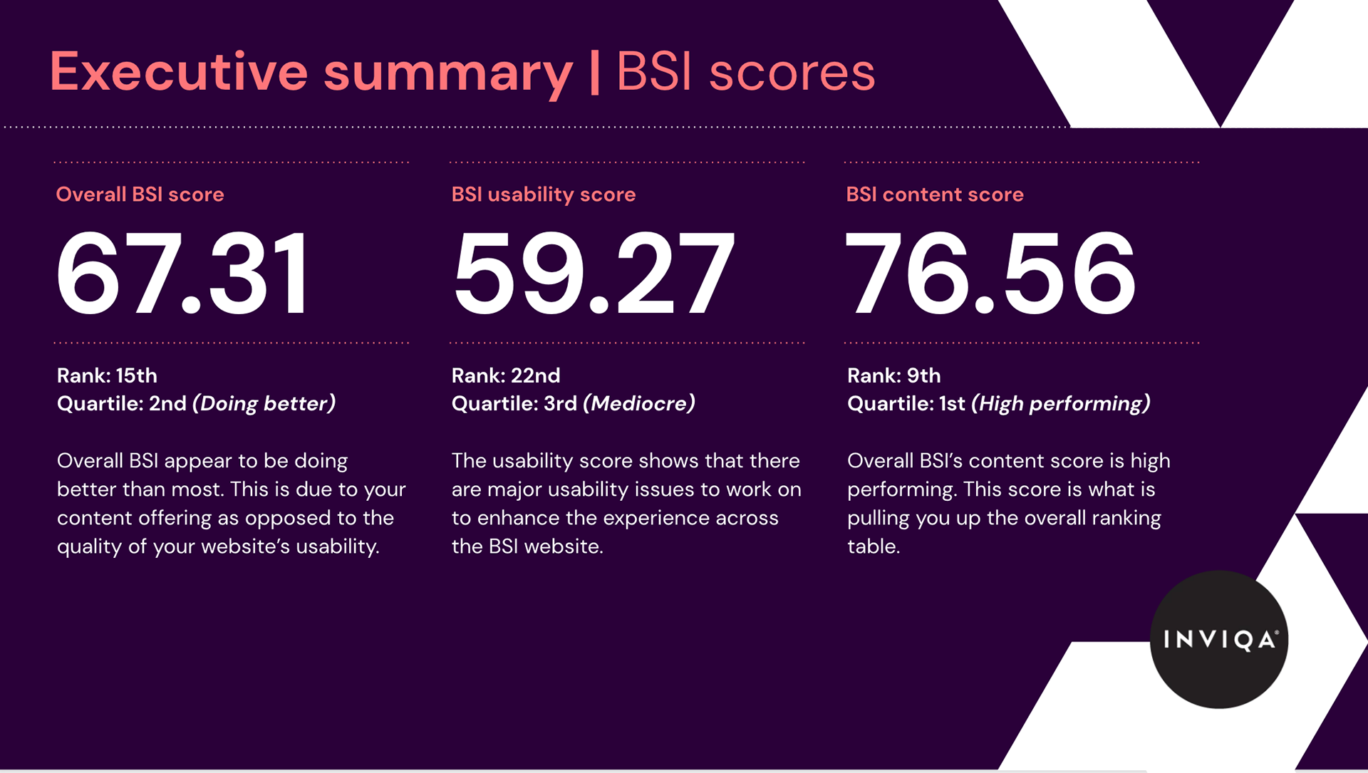
BSI ranked 15th out of 41 companies over all. They ranked 22nd in usability and 9th in content. The report came out to 270 slides.
Our executive summary was:
The quality of BSI’s website's user experience is consistent across all of the journeys we tested. This helped BSI get the score it did. However, the website still has a long way to go to improve its score to get amongst the leaders. There is a big point gap between the leaders and BSI.
BSI is being pulled up the ranking table by it's high content score (76.56). If we rank on content alone, BSI finish 9th. But if we were to rank just on usability, BSI finishes 22nd. This indicates there are a lot of improvements BSI can make from a usability perspective.
What does this mean for BSI?:
We identified 4 areas in which BSI is falling short of the leaders. To increase BSI's score you should look at improving:
- Overall visual consistency across tools, domains and URLs
- Page structure and narrative
- Usability of forms
- Readability of content
We therefore recommend focussing your efforts on these areas for improvement in order to stand out from your competitors.
Snap shot of the journey matrix. We went though each website before scoring to see which one had which journeys:
Scoring criteria:
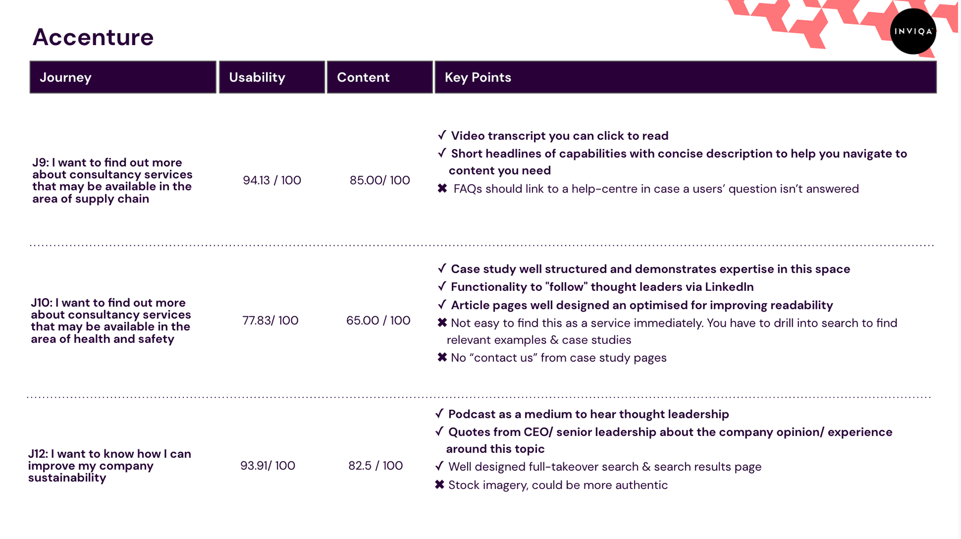
This is what each competitor looked like, you can see the criteria in red/brown, the weighted and average scores below that. Then each journey was broken out into a row (8), key points noted and scored:
Snap shot of the report:
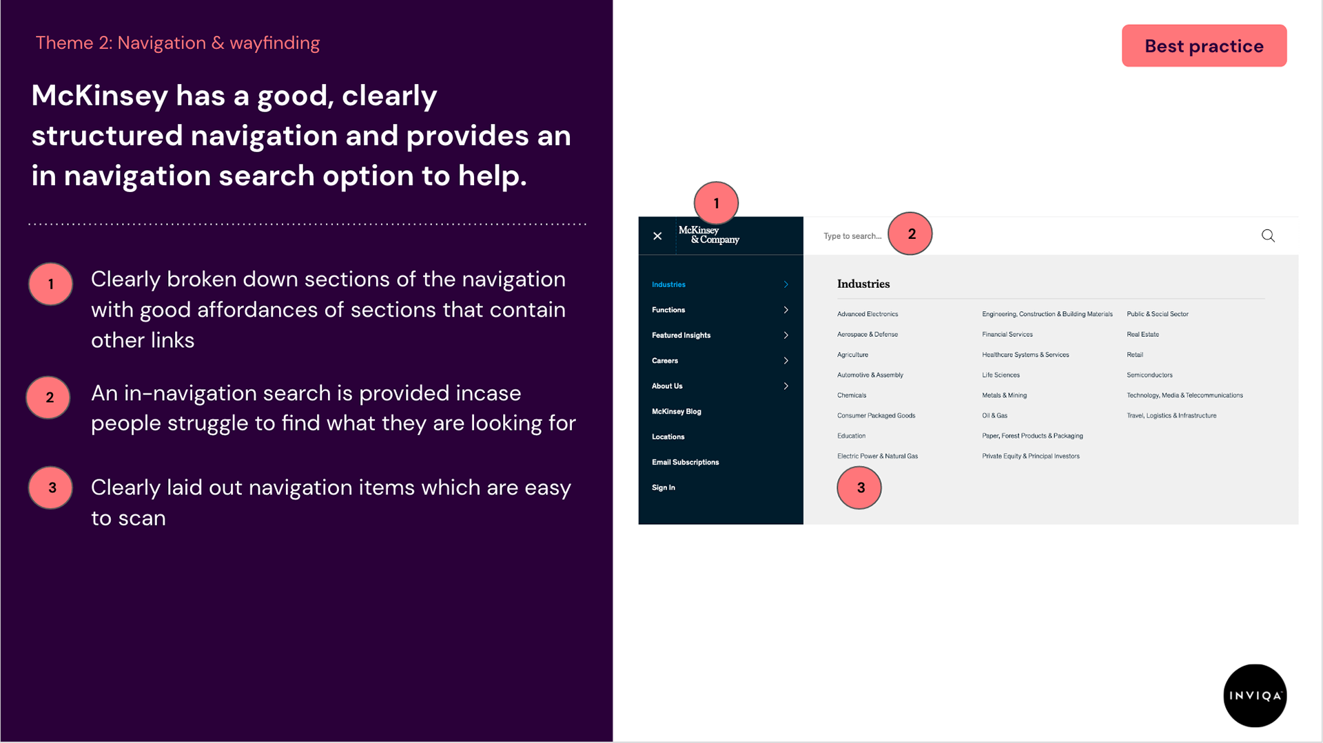
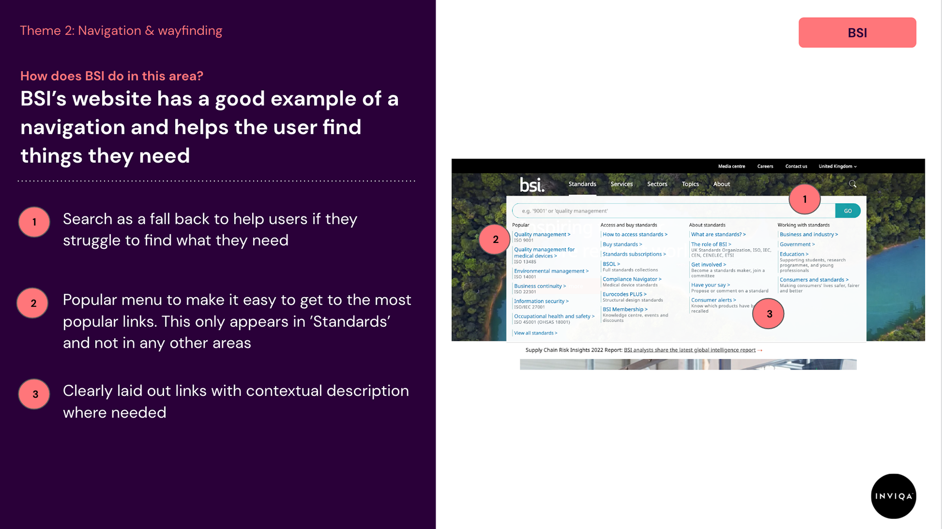
We pulled out themes that websites did well and compared how BSI performed against each theme.
Each journey had this analysis for it to show exactly how the specific journey experience that BSI had compared to their competitor:

Every company got an overview slide showing movement from the last benchmark, a summary, key points we learnt and a summary of what and why things had changed.
Each company also had individual journey scores and key points from each journey.

Radar diagrams to show what areas BSI and each competitor differ in.
Tools
Google sheets, Google Slides, Figma
Role
Lead Experience Designer