Client
Stanley International Betting
Project
Redesign the Stanleybet online casino.
Results
€28 Million revenue in the first 4 months.
€350-700k average revenue per day.
47% increase in player spending.
7x The sportsbook revenue (normally the most profitable part of an online betting platform)
We also spotted a major pain point in our registration user journey while desiging the user flows for this, this lead to a major overhaul of the user registration journey.
About
Redesigning an Italian casino is no easy challenge, coming up with a design that can generate massive revenue due to high RTP (return to player) payment percentages. Encouraging the users go from the landing screen to playing a game as quickly as possible was key. There are many tricks and tac tics I used to do this.
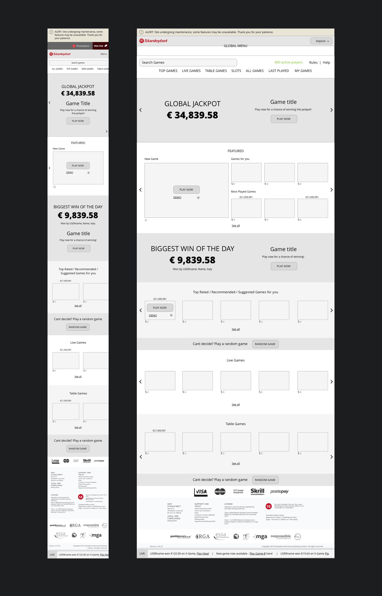
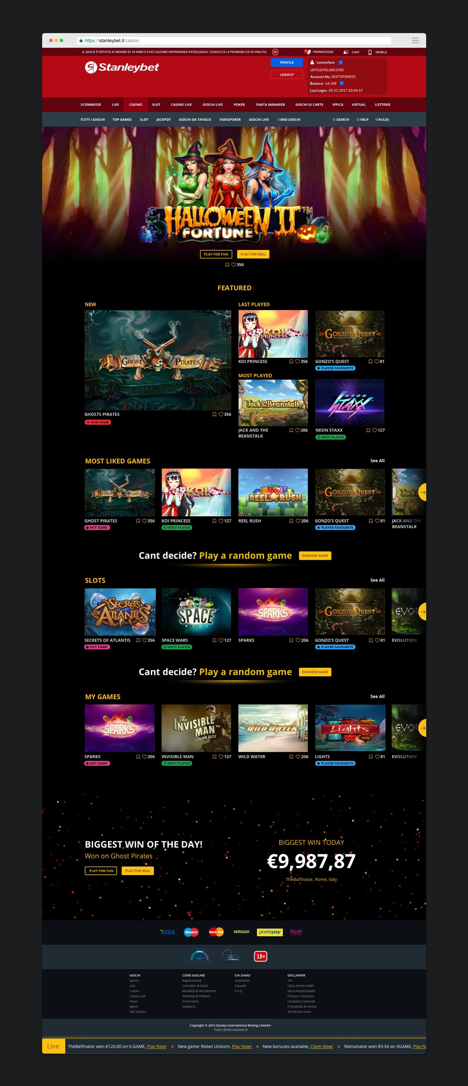
The casino needed to hold hundreds of games (550+ was my last count) from various game providers and in order to do that I needed to look at a way to display this massive amount of content in a familiar way to avoid long dwell times in the Casino Lobby (landing page). For this I looked to video and game providers’ UI and UX. Horizontal scrolling is key in most of these interfaces making it easier for users to digest the content. Broken down into categories. Starting with the most popular categories on the Lobby itself with the rest being displayed in a secondary navigation where the other games where easily filterable.
Presenting limited choices when the user first gets there was to help the user choose a game quicker, the more choice users are initially presented with the longer it can take to choose a game and the more frustrating it becomes. We all know what a rut we get into when scrolling endlessly through the Netflix list, this is something I wanted to avoid with our users. We gave them only the main options. The game the business wants to promote. The newest game to be added to the catalogue. The users last played games in case they want to go back and play again and the most played games on the site, if everyone else is liking them then other users may too. We then have the most liked games by users, Slots (most popular game type) and their saved games. The rest accessible via a secondary navigation.
As a failsafe to a user not being able to choose a game we added a game randomiser which selects a game for a user if they are unable to choose one. This is a great way to introduce players to new games they may not have considered. To the user this appears to be a random game when in reality its actually a curated list of our top revenue generating games. This component turns into a registration call to action when logged out.
Liking (heart icon) is a great way to introduce social gratification, combined with a like total, this starts to order the games across the casino by most popular, the more likes it gets the higher it goes up the list. This shows to users that others are really enjoying these games so they may too, further enticing them in and get them playing as soon as possible. We avoided ratings in any form because it was too subjective, a game one user dislikes then gives it a bad rating another may like. We’ve all had that argument with your best friend over your favourite game and they disagree, we felt this was similar, so stuck to straight likes.
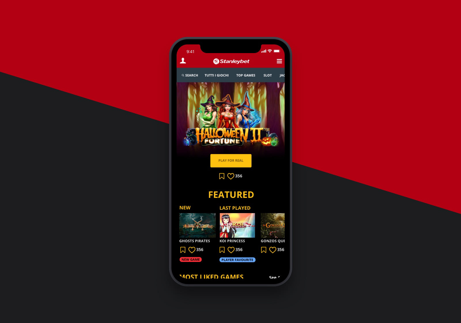
We also introduced 4-5 game tags these can be seen in the little coloured bars under the games to help users make a quick decision by highlighting what is paying out the most (hot game), what is the most played today, what is the most liked and what is the newest game.
Allowing users to bookmark games in their own area to come back and play again instead of sifting through to find it again allows our more familiar users to come back and play their favourite games easily by simply going to ‘I MEH GIOCHI’ (My Games) and play all their favourite games helpfully broken down into categories so they are easier to find if they have a lot saved. As well as presenting them with recommendations based on what they have saved.
Subtle animations through out the site encourage users to choose quicker. Aiming to rush them along into a game selection we added subtle button wobbles, animations to the primary banner at the top and ticking jackpots all to tap into the users fear of missing out and speed them up in choosing a game.
Ideation
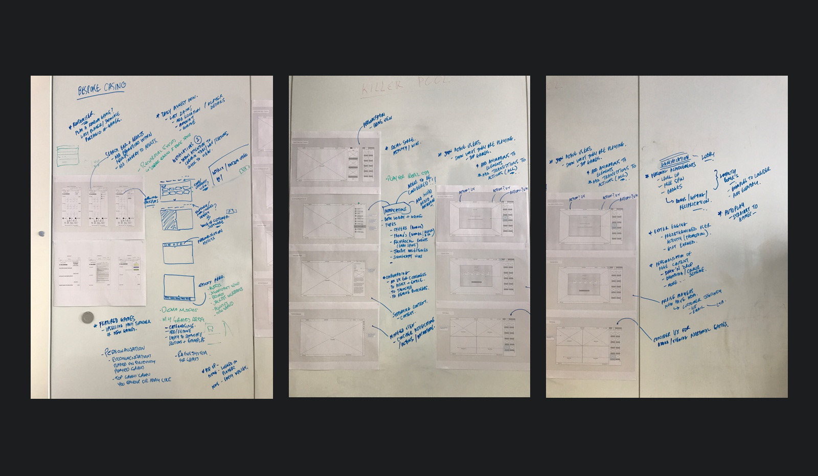
Wireframes
UI and Visual Design
Tools
Sketch, Adobe Photoshop, Adobe Illustrator, Marvel, Mirr.io (Sketch plugin), Zeplin