Overview
The Bike Club offer subscription children's bikes (and scooters) for low monthly costs. They also offer to swap that bike for a larger one to match a child's growth as they get older. They are growing fast, receiving a lot of investment and recently starting in Germany as well as starting a new brand campaign to advertise the club.
Problem statement
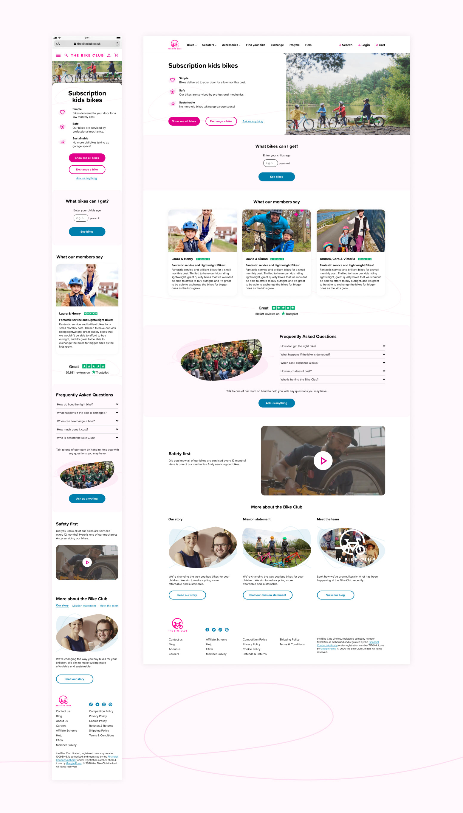
The Bike Club needed a new homepage for their 23,000+ existing members and new perspective members.
One of the key things for the homepage was to communicate a clear and trustworthy proposition while also highlighting the benefits of The Bike Club. It was clear from some of their research that people thought the proposition was too good to be true and they needed first impressions to in still trust and authenticity.
Users and audience
The main audience are parents with younger children that are ready for their first bike. If they can appeal to this audience there is a high chance that they can retain the customer for longer - as their child grows they need a bigger bike so they can swap it for one with The Bike Club.
Their secondary audience is grandparents (and family members) who gift bikes to their grandchildren.
Roles and responsibility
The project team: Experience design director (oversight), experience designer (leading), project manager, senior front end developer, chief marketing officer (The Bike Club), COO & founder (The Bike Club), product manager (the Bike Club).
My roles and responsibilities:
- creating and facilitating the stakeholder workshop
- stakeholder management
- analysis
- UI design
- visual research
- sketching / wireframing
- collaboration with the client
Scope and constraints
We had previous research to go off when designing this new page that had specific recommendations and findings for the homepage but sadly we didnt get to test the new design to validate it due to budget. But the previous research we did was factored into the new design.
I also had to tweak their existing brand to make it accessible as the colour combinations did not meet recommended colour contrast ratios.
Process and what I did
The first thing we did was have a collaborative workshop with the clients key stakeholders and had a series of tasks.
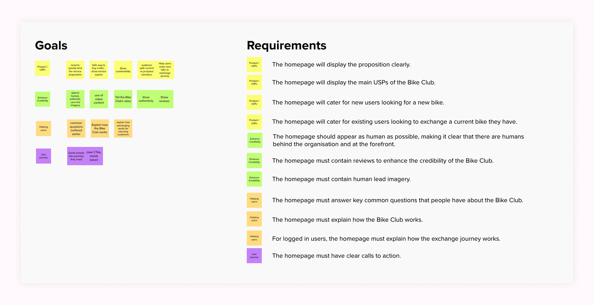
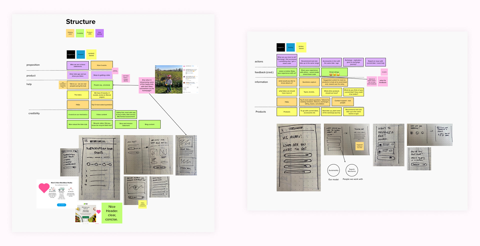
I then took the results of the workshop and compiled them in to goals and requirements/jobs to be done against key themes. I then took these forward and started to ideate page structures and potential content for a new and existing customer.
I then compiled visual research and started on high fidelity mock ups.
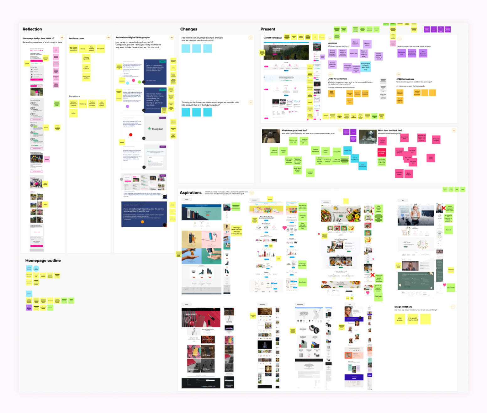
Workshop
The collaborative workshop with the client, I broke it down into 6 tasks in order to get the information I needed:
- Task 1: going over an existing homepage concept from a previous usability testing project to see if there was any of it that we wanted to take forward.
- Task 2: going over the audience types and their behaviours.
- Task 3: re-looking at existing usability research again to see what parts are still relevant for this project and if there is anything we want to take forward.
- Task 4: Looking at and evaluating the current homepage to see what does and doesn't work.
- Task 5: What does good and bad look like.
- Task 6: Aspirations - looking at inspiration and taking out any points that we do and don't like.
Goals and Requirements
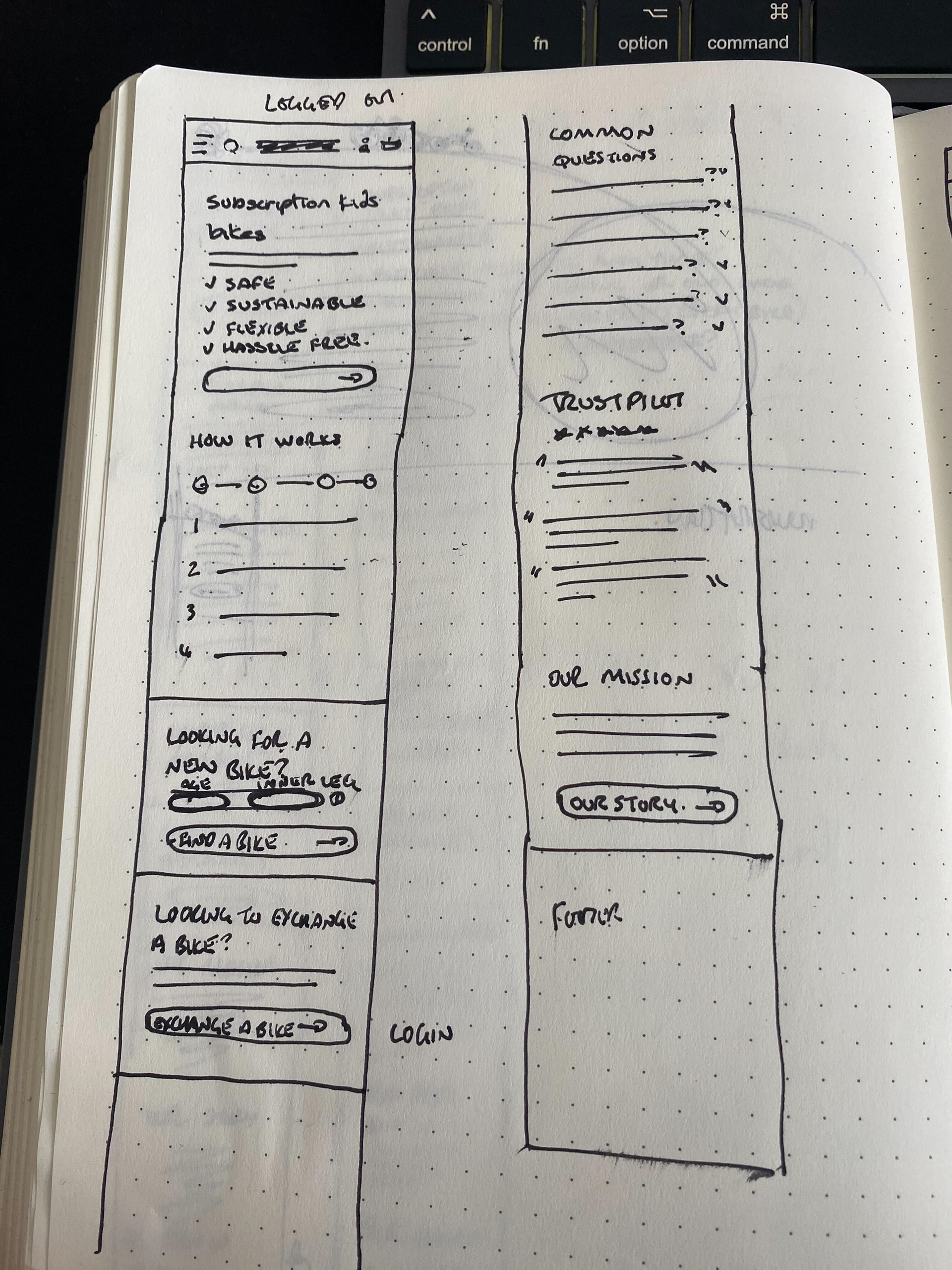
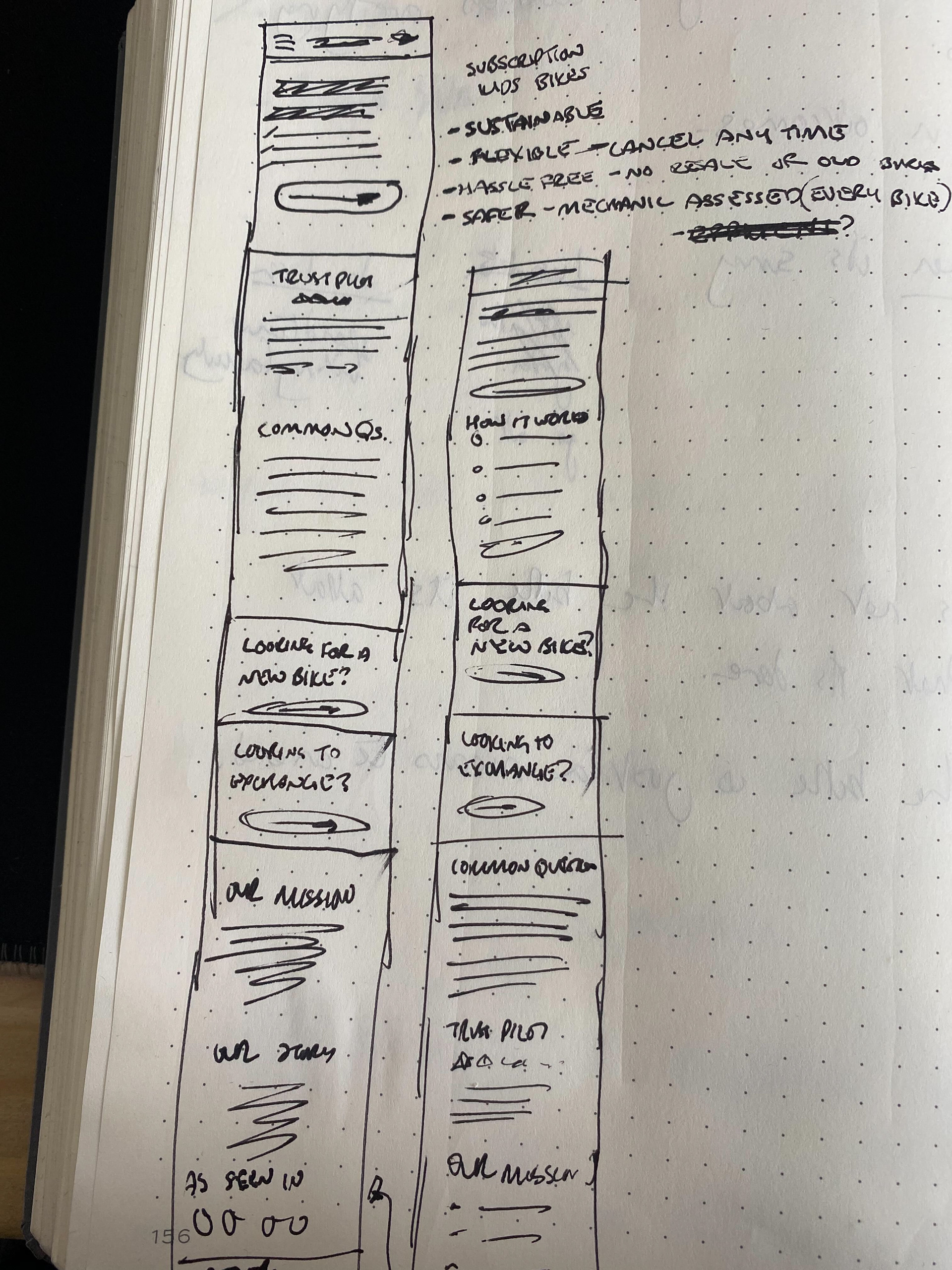
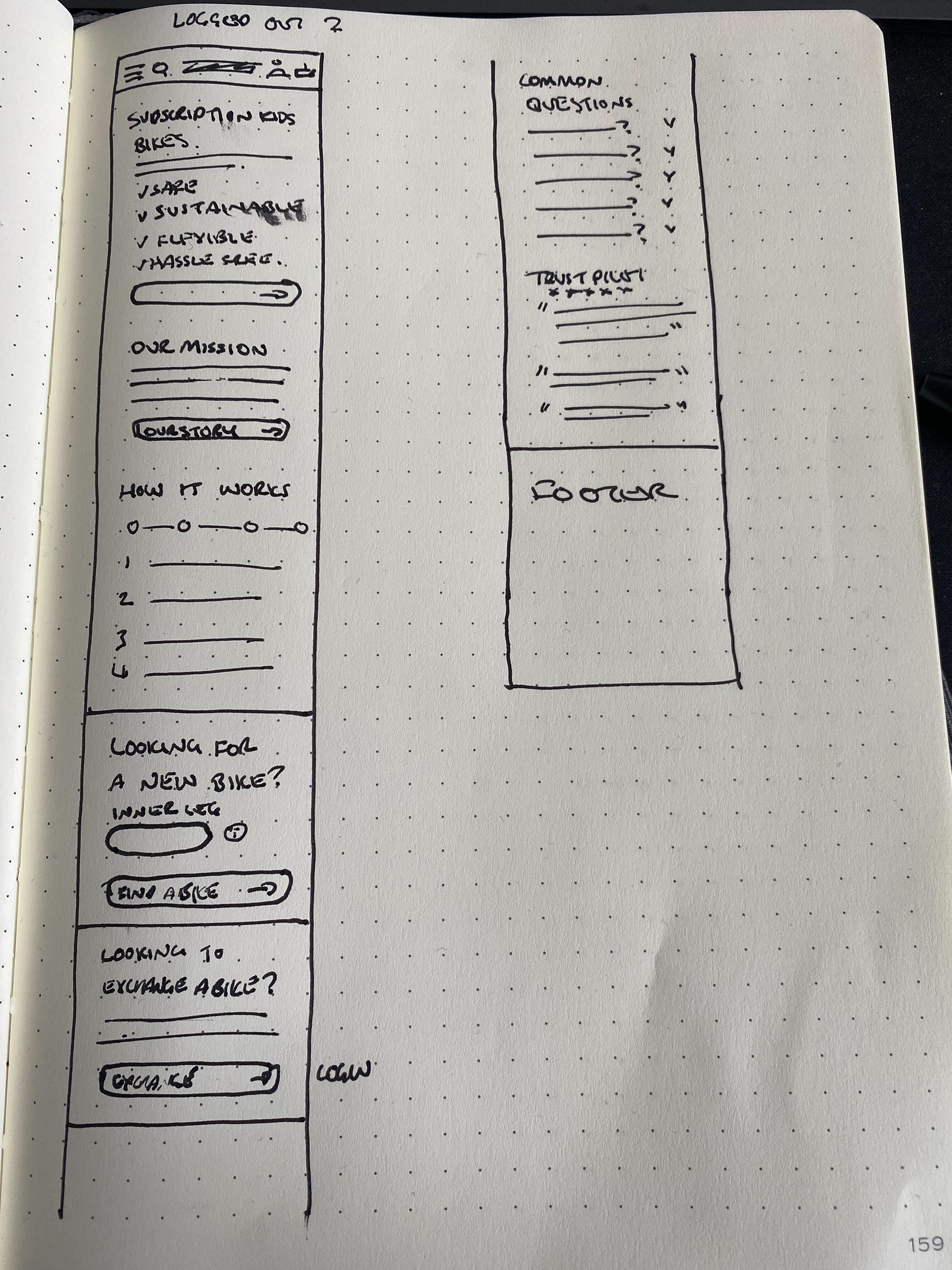
New vs Existing Customer Page Structure
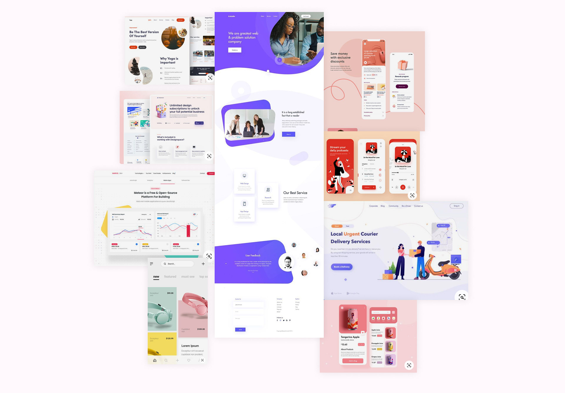
Visual Research
Sketching
UI and Visual Design

Tools
Figma, Mural
Role
Experience Designer
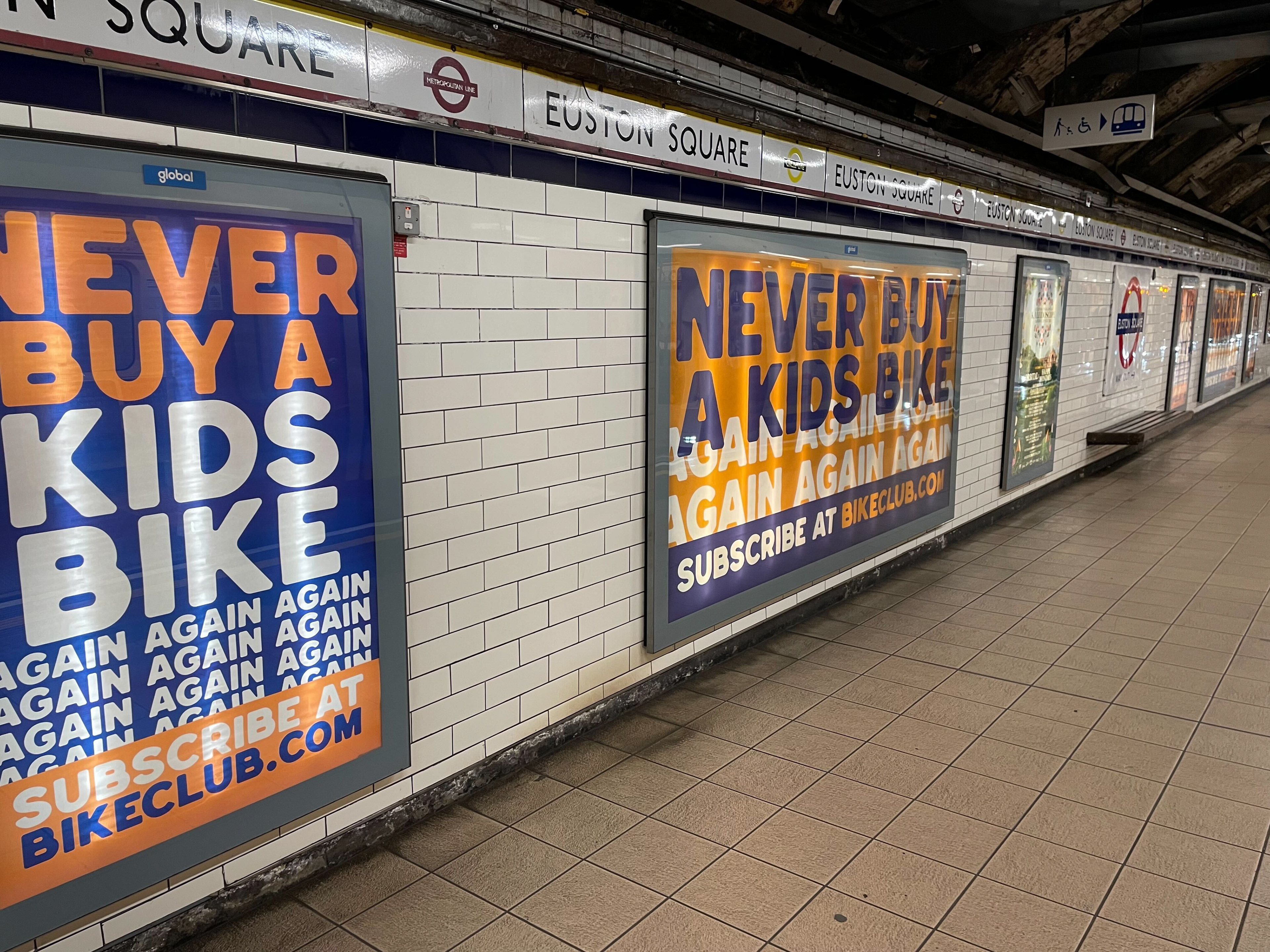
Update since the project:
The Bike Club have commissioned a huge ad campaign on TV and print you can see the ads below. They have also rebranded after we flagged that their current brand was not accessible.