Overview
c2c operate the main train line into London from all over Essex. In their stations (depending on their size and how busy they are) they have 2-6 ticket vending machines or 'TVMs'. These are used to buy and collect tickets, top up oyster cards and smart cards. You can also use them to check train times, prices and journey details.
Problem statement
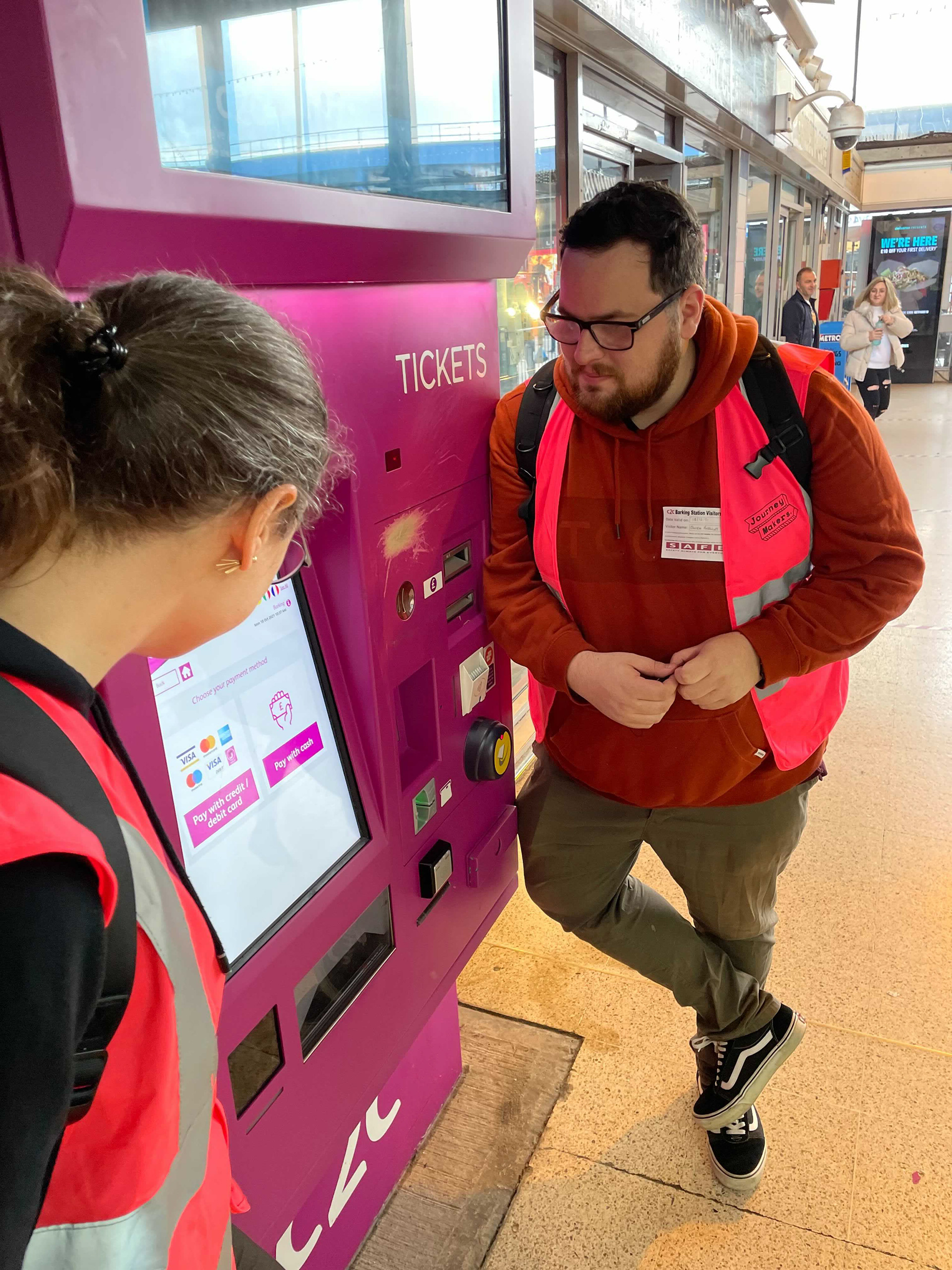
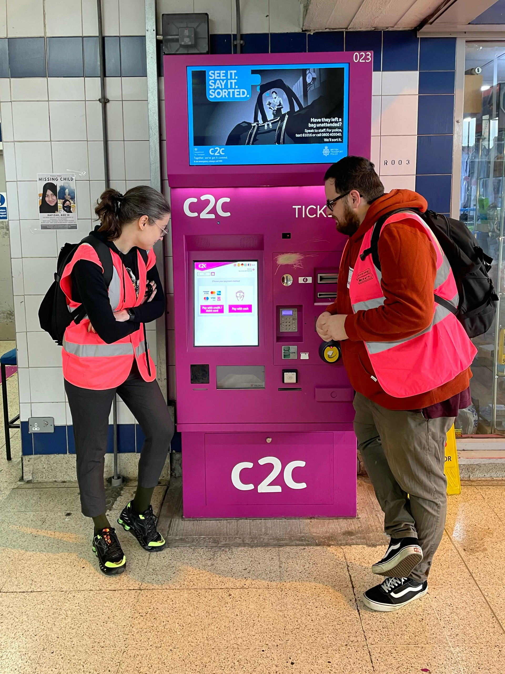
The TVM machines is one of the highest digital channels used for c2c, it is also the most complained about from customers. We researched the TVMs to learn more about them, to uncover potential issues and pain points in order to build out a roadmap of improvements of the TVMs for c2c. As part of that research some UI improvements that needed to be made where discovered.
Users and audience
Main users and audience is commuters and shift workers. People also using the machine to top up oyster cards.
Roles and responsibilities
The project team: Lead Experience Designer, Senior Experience Designer (me), Senior Client Partner, x2 Product Owner (c2c)
My personal roles in the project where:
- Owning the UI design
- Building a new design system for the TVM machines
- User journey mapping
- Presenting the designs to the client and explaining the rationale behind design decisions
- Making sure the findings of the research have been captured in the designs
Scope and constraints
The project was very lean we had to fit a lot in a short time. Also anything related to the oyster card top up journey was out of scope as this is purely a TFL integration and c2c have no control over this.
The TVM hardware does not allow for scrolling or gesture interactions, everything must be done by tapping only.
Process and what I did
We took the UI based findings from the research conducted on the TVMs, prioritised them and built out a roadmap to design the new screens and journeys.
For each item on the road map we sketched out what the new screens should look like based on the research findings. We researched UI design and patterns to influence the designs and potentially improve on our sketches. We then went into UI design.
As the designs grew we also started to build out a design system to live along side the current web design system.
Outcomes
We produced designs that solve the problems discovered in the research.
Old vs new home screen
Infrequent users found the old screen quite overwhelming with lots of options, pink flashes and details. We looked at stripping back details and colour to make it less visually overwhelming. Utilising better typographic hierarchies, more white space and prioritising the main user actions/goals at the top of the screen.
Old vs new date and time picker
Users found it difficult to know how to change the date and time of travel as it wasn't obvious. The date and time picker interaction itself was fiddly, difficult to select options and the calendar interaction wasn't reflective of the users goals, most wanted to travel there and then, it was rare they wanted to travel in advance. We decided to put more emphasis on the time selection and defaulted all options to travelling now.
Old vs new journey selection
The main issue with the old screen is that people didn't know where to tap to select the ticket/journey they wanted. We wanted to reduce visual clutter and keep the most vital information and elements on the page.
Tools
Sketching on paper(!), Figma
Role
Senior Experience Designer
Research of current TVMs in Barking:

